Errors to Avoid in Web Design
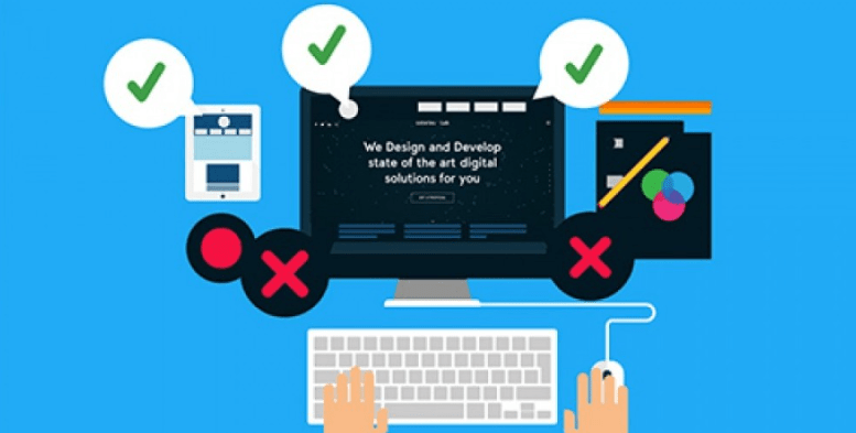
Between the client (owner of the future website to create) and the web designer, the perception on the aesthetic aspect of web design project differs and this divergence can persist even during the execution. In what follows, we will list some famous errors to avoid when working as artistic staff of any graphic design studio or digital agency.
Fusion between 2 graphics models
One of the fatal mistakes in the artistic direction is to ask for a mix of two models in order to take advantage of the good sides of each one. However, each graphic design has been subject to a unique perception and if we try to merge it with another graphics model, there is a strong risk of reducing its value and end up with a disoriented model. The ideal solution in this direction is to explain to the designer what we are looking for and what our goals are. We can show them other models on other platforms and propose colors that we admire. Thus, the web designer will find an artistic style that is more harmonious and fascinating to you!
Specific changes without harmony with the whole
Once the designer delivers the designed website template to the customer, the customer carefully checks it to note any small changes to the design without taking into account the overall harmony of the graphic design. As a result, the end result is far from satisfactory to the customer even with the changes made. Instead of this inappropriate method, it is better to agree with the web designer to find another recent and harmonious design taking into account the desired points. Know that the web designer is an expert in the development of any visual identity so it is necessary to use his knowledge through his advice.
Congestion of information on the same screen
Nowadays, the web design world has experienced a strong progression at the technical and artistic level so you must overcome the old barriers and constraints. Now, the scroll is one of the trends of web design commonly used especially with the appearance of various animations like the Parallax effect (Parallax Scrolling) encouraging more verticality in the web pages of any website created. Because the user experience is at the center of the major concerns of web professionals, your graphite design is supposed to align with this setting by further developing the content and structuring it.
Poor quality photos
Many of the owners of websites use the photos for their commercial activity without having any knowledge of photography, technically or artistically, and the result will be far from sublime. They entrust the relooking of the photos to the artistic direction of the web agency but the final rendering remains mediocre which gives a negative image to the project as a whole. Since digital communication is strongly based on the visual aspects, think to dedicate a reasonable budget for the taking of the photos representative to the values and the spirit of your trade to assure you a perfect quality of your photos. But you must realize that the reasonable budget can vary from one place to another. Reasonable budget in Porto is different from the one in Madrid.
Confusion between the desires of the owner and the aspirations of the target
It is natural that the owner of a website hopes to have a similar rendering to his character traits and his personality. Many web designers are less able to capture the characters of their clients so the potential for incompatibility will be greater. Every web designer should take into account the behavior patterns of the targeted customers before taking an interest so that they can receive fruitful results in the long term.
